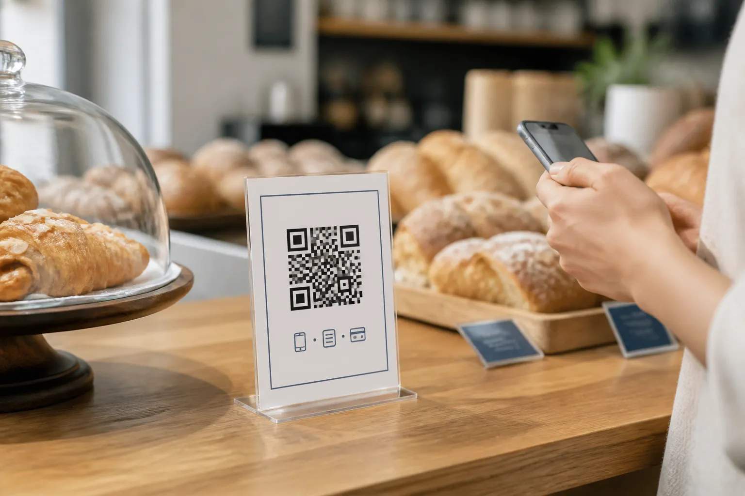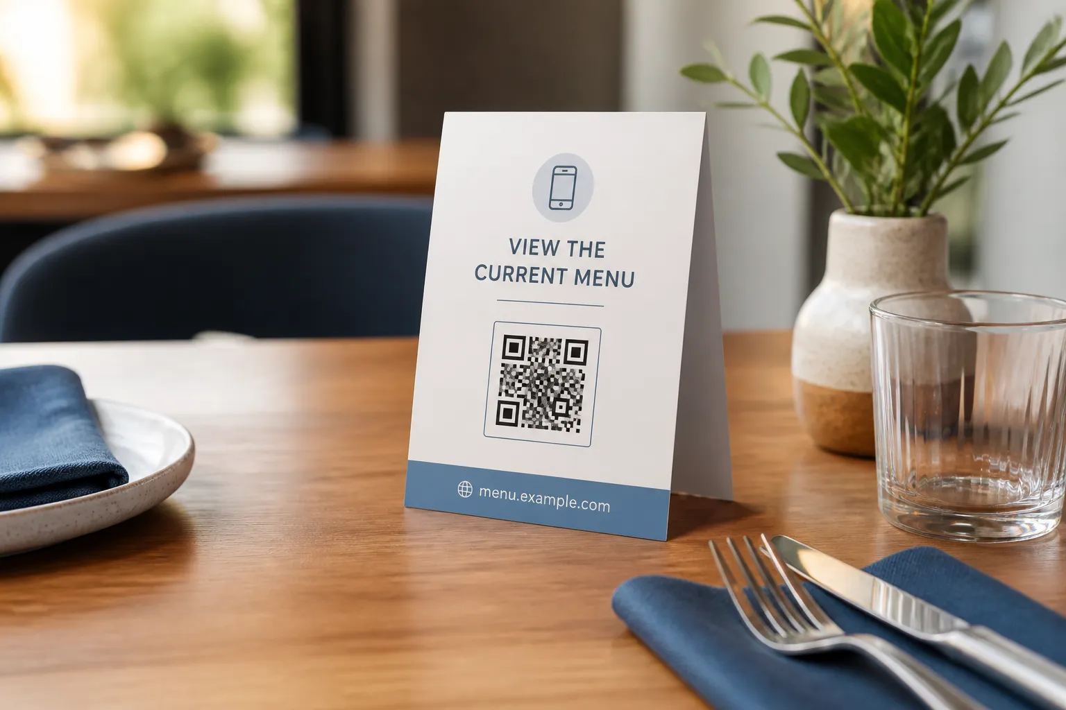
Stand in the aisle of a hardware shop and watch someone try to buy a replacement water filter. There are five boxes that look nearly identical, the appliance model numbers are printed on the back in tiny type, and the customer is holding their phone with a photo of the old cartridge, squinting between the two. This is the exact moment a QR code can be brilliant or useless, and most shops manage useless. They slap a code on the shelf that opens the category landing page, and now the customer is standing in front of the thing they want, scrolling a website that lists forty products including the one six inches from their face.
A code in a store is not competing with nothing. It is competing with the packaging, the shelf label, the staff, the signage, and a shopper who wants to be out of the aisle in ninety seconds. It only earns its place when it gives depth that genuinely will not fit at the shelf edge.
Extend the shelf, never hide it
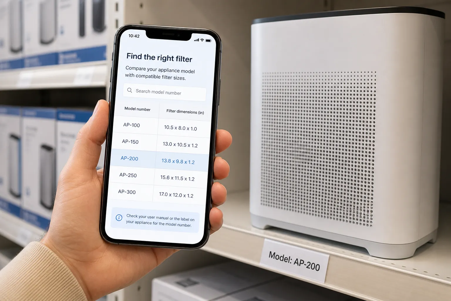
The useful retail codes add the thing that could not be printed small enough to be readable: a full compatibility table, an assembly walkthrough, a captioned demonstration video, material provenance, an accessible manual, real care instructions, or live stock across nearby branches. That is depth. It rewards the scan. Some of that same depth belongs on the product’s own packaging, not only the shelf label, whenever the manufacturer controls both.
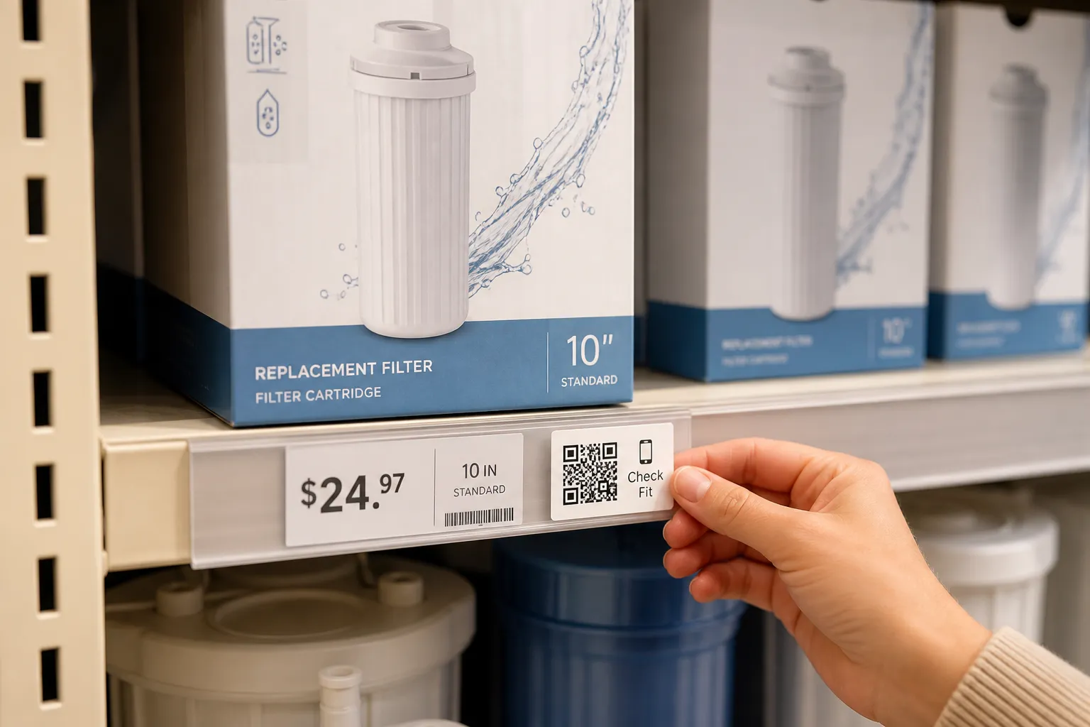
What must stay visible on the shelf is the boring, load-bearing information: the price, the essential warnings, and enough product identity that a person knows what they are looking at without any phone at all. The instant a shopper has to scan a code to find out what something costs, you have not modernised the store, you have added friction and a whiff of a trick. Price behind a scan reads as hiding the price. Keep it on the label.
And label the code with an outcome, not a shrug. “Check which appliance models this fits” earns a tap. “Learn more” earns a scroll past. The two words after the promise are doing more work than the code itself.
Land on the exact product, not the neighbourhood
Nothing corrodes trust faster than scanning the code beside a specific item and landing on a generic page that makes you search again. Use stable product identifiers and physically test that every shelf label resolves to the correct variant, not the family. The 500ml and the 750ml of the same thing are different pages, and if the labels are swapped, the customer buys the wrong one on your recommendation.
When packaging or SKUs change, keep redirects alive from the retired paths and watch for mismatches, because a store re-shelves constantly and old labels linger behind new stock. And keep the URLs boring: no personal data, no guessable order numbers, nothing in the address that a passer-by could edit into someone else’s information, the exact mistake privacy considerations for QR codes covers in more depth.
Think about where the body has to stand
A shelf code faces the same physical constraints as any QR code used in print marketing: readable size, real contrast, a stable surface. A code is a physical instruction to stop and hold up a phone, so put it somewhere a person can actually do that. Not at the mouth of a narrow aisle where they will block a trolley. Not so low they have to kneel, or so high they reach across a display of glassware to line up the shot. Consider who shops the aisle: a code for reading glasses should not sit at ankle height.
And never place codes where scanning is dangerous. No codes to be scanned mid-stride on a staircase or escalator, at the top of a ladder in the trade section, or anywhere near powered equipment. The store controls the lighting and the sightlines in a way a poster on a wall never can, so use that control. A slightly matte finish and even light beat a glossy label under a spotlight that throws glare straight back at the camera.
Assume someone will tamper with it
Here is the retail-specific threat that print marketers worry about less: a code stuck to a shelf is trivially easy to cover. Anyone can print a sticker and slap their own code over yours between the morning shift and lunch. The customer scanning it has no way to know.
Defend it on a few fronts. Surround the code with your own printed artwork so an overlaid sticker looks obviously wrong. Show the expected domain in plain text beneath it, so an alert shopper can spot a link that points somewhere strange. Inspect the high-risk spots - entrances, end caps, anything near a door - as part of a normal walk-round, and train staff to peel off anything that looks added rather than printed. Teach the browser habit too: glance at the domain before opening it. The whole point is that a legitimate code and a hostile one look identical, so the surrounding context has to carry the signal.

Give the phoneless a way in
Not everyone scanning a shelf has a working phone, data, or the eyesight to read a mobile page. If the extended information matters - and if it did not, why print the code - make sure a staff member can pull the same page up on a store tablet and read it with the customer. The comparison table that helps the filter buyer helps them just as much when an assistant is holding the device. Design the destination to be usable by staff, not only by the shopper, and the code stops being a barrier for the people it was supposed to help most.
Do that, and the code becomes the quiet extra shelf the store never had room to print. If you’re still weighing whether a code is worth the effort for a smaller shop, practical QR-code ideas for small businesses covers that broader decision.
Create the code you need
Use HighEndDIY’s private browser tool, then test the result in the setting where people will scan it.
Create a QR CodeFound something that should be corrected? Email [email protected].