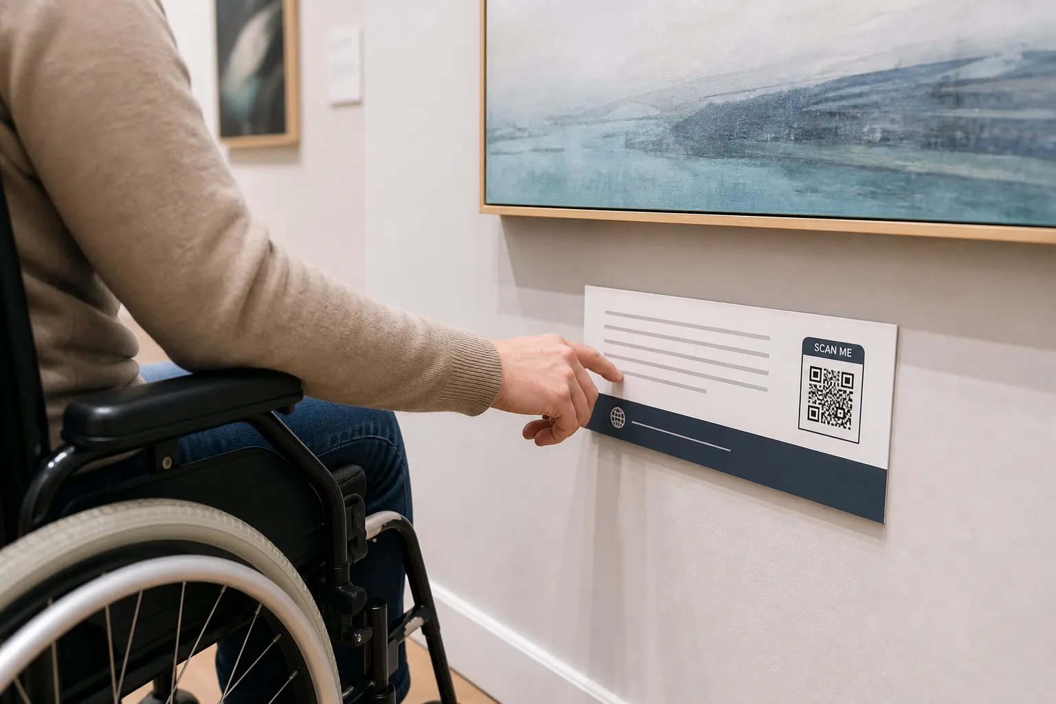
At a gallery a few years ago I watched a woman using a wheelchair try to reach a QR code that a curator had placed, with the best intentions, at the standing eye level of an average adult. She rolled up, tilted her chin, lifted her phone above her head, and got nothing but glare from the spotlight above the label. Beside her, the printed text she could actually read said only “Scan for more.” More of what, she never found out. She moved on to the next room.
That code was flawless by any technical measure. It decoded instantly. It just did not work for her, and the reason had nothing to do with the square itself. Accessibility for QR codes is not a property of the pattern. It lives in the whole chain: finding the code, reaching it, understanding what it offers, operating a device, loading the page, and finishing the task. A break anywhere in that chain locks someone out.
Scanning should never be the only route
Start from a simple commitment: a person who cannot or will not scan should still be able to get the same thing. What that alternative looks like depends on the task. Sometimes it is a short readable URL a person can type. Sometimes it is a phone number, printed content on the spot, or a staff member who can help. For a payment or a check-in, the equivalent path has to actually complete the same job, not just gesture at it.
One thing that does not count as an alternative: “ask someone else to scan it for you.” Handing your phone to a stranger, or depending on a companion you may not have brought, is not independent access. Neither is a fallback that technically exists but delivers a worse experience. And whatever you do, keep the truly essential information - safety notices, prices, deadlines, emergency instructions - visible in plain sight, never locked behind a scan. The same principle applies to a classroom, and QR codes in education works through what it looks like there.
Tell people what is behind the code
“Scan me” asks for a leap of faith. Replace it with a description of the outcome and the conditions. “Open the audio-described tour, about four minutes” tells a person what they get and roughly what it costs them in time. That single change respects everyone, and it disproportionately helps people who are deciding whether the effort is worth it: someone rationing mobile data, someone with limited stamina, someone who needs to know before they commit.
State the awkward conditions up front, before the scan, not after. If the destination requires a login, a payment, an app install, a large download, or audio that will play out loud in a quiet room, say so on the printed label. Nobody likes discovering a 40 MB app requirement after they have already walked over and pulled out their phone.
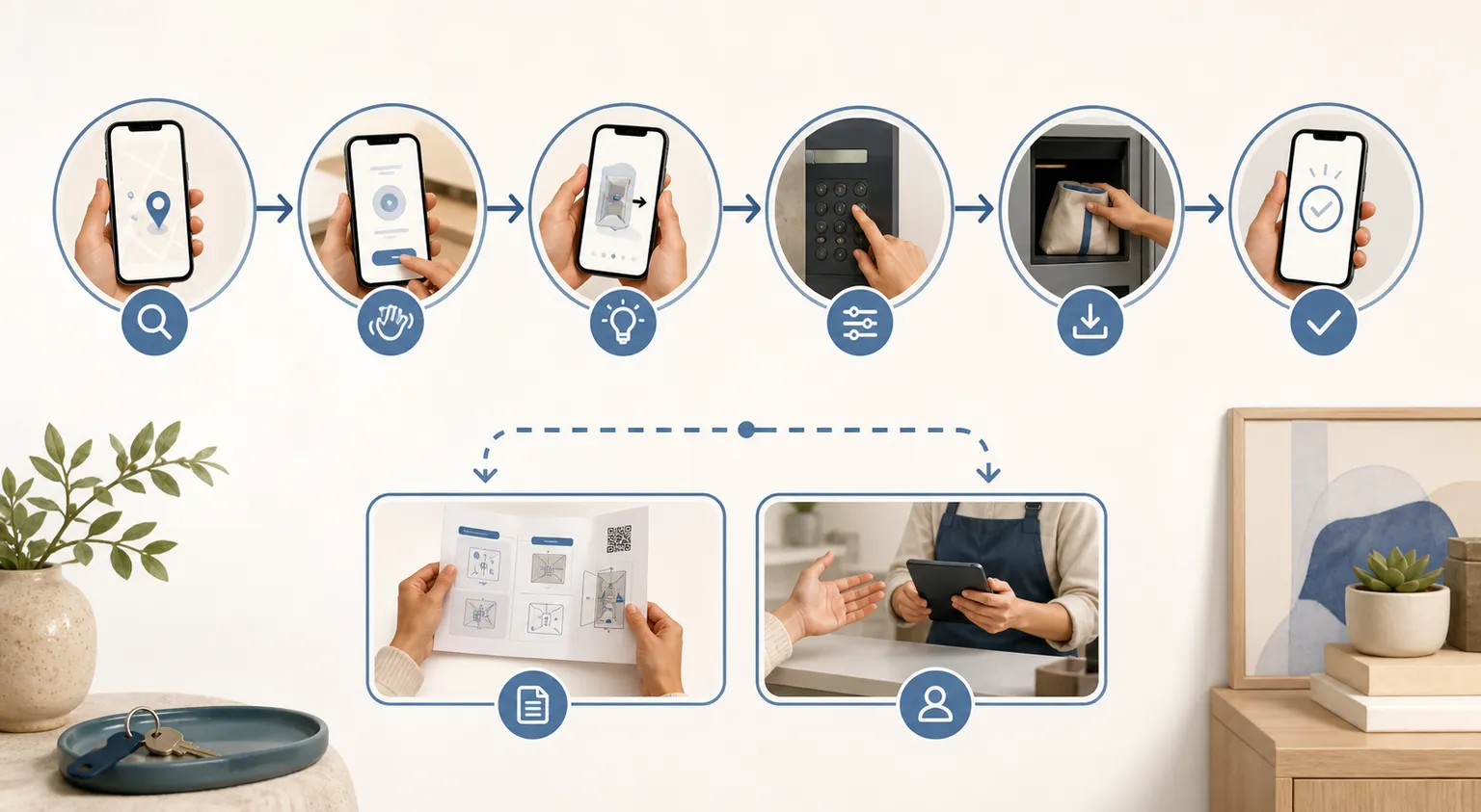
Make the physical code findable and reachable
Before anyone can use a code, they have to locate it and get a phone in front of it. That is a design problem, and it is where a lot of otherwise good work falls apart. Give the code strong contrast against its background, enough size for the scanning distance, and a complete quiet zone of clear space around it so the camera can lock on.
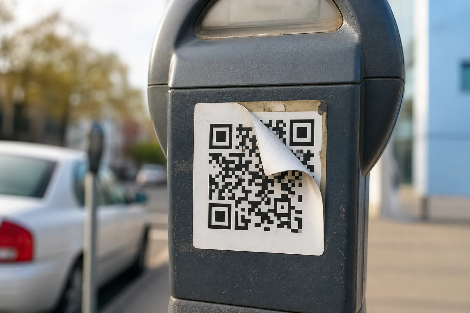
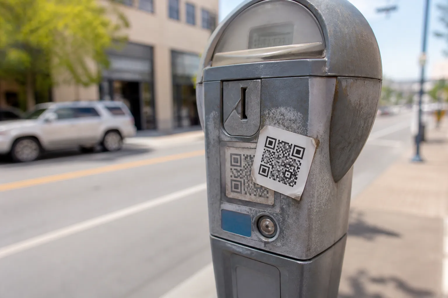
Then think about bodies that are not average. Mount codes at a height a seated person can reach and photograph without straining. Avoid glare from spotlights and window light, moving or curved surfaces, deep recesses that force an awkward angle, and any placement that asks a person to crouch, stretch, or hold a pose. These are the same physical failure modes covered in why QR codes fail to scan. Consistency helps too: if codes always sit in the bottom-left corner of your labels, people learn where to look. Tactile markers can help a blind visitor find a code, but only if you have designed and tested that system deliberately - a random raised sticker is not wayfinding.
The destination is where accessibility is usually won or lost
You can nail every physical detail and still exclude people the instant the page loads. The landing page carries most of the weight. Build it with semantic structure so a screen reader can navigate it, keyboard access with a visible focus indicator, text contrast that holds up, and layouts that survive a person zooming to 200 percent. Provide captions and transcripts for any audio or video, write link text that means something out of context, and make forms properly labelled with clear, specific error messages.
Resist the urge to force a native app when an accessible web page would do. Every app install is a barrier - storage, an account, a platform requirement, a learning curve - and for a one-time museum tour or a menu, it is rarely justified. If the web can meet the need accessibly, let it.
A worked example that respects everyone
Picture a museum label done well. It carries a concise printed description a sighted visitor can read on the spot, a short typeable URL, and a code clearly labelled “Audio description and full transcript.” A tactile locator helps blind visitors find the code, and the museum tested that locator with blind visitors rather than guessing. A loan device sits at the desk for anyone without a suitable phone. The mobile page does not autoplay sound into the quiet gallery, lets a visitor read the transcript straight away, and never demands acceptance of non-essential tracking before it shows the content.
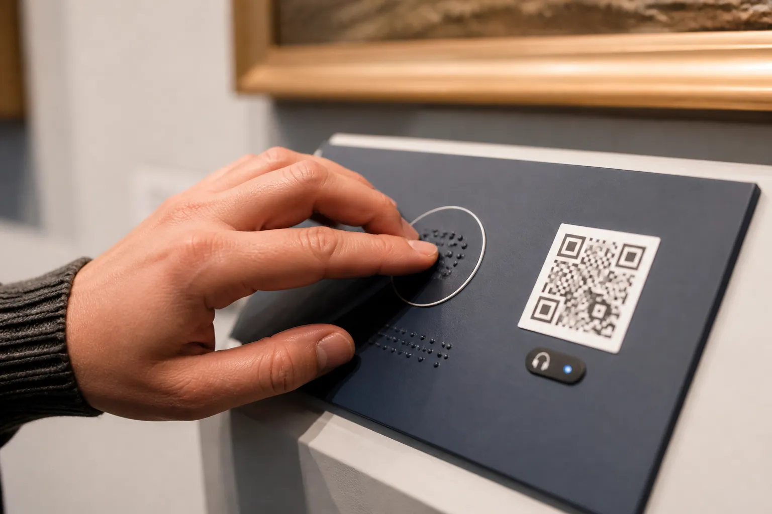
Notice that this design does not pick one type of user to serve. It layers routes so that the seated visitor, the blind visitor, the visitor with no data, and the visitor who simply prefers reading all arrive at the same place.
Test with actual people
Automated checkers are worth running. They catch broken markup, missing labels, and contrast failures on the page quickly and cheaply. But a tool cannot tell you whether the code sits at a reachable height, whether the language makes sense, or whether the overall journey holds together for a real person under real light. Only people can tell you that.
So bring disabled people into your research and your reviews, pay them properly for their time and expertise, and treat what they find as data rather than opinion. Write down the barriers you have not yet fixed, so the next iteration starts from an honest picture instead of a hopeful one, ideally as an entry in a proper pre-launch checklist rather than a scattered note. That is the difference between a code that passes a checklist and one that actually lets everybody in.
Sources and further reading
Create the code you need
Use HighEndDIY’s private browser tool, then test the result in the setting where people will scan it.
Create a QR CodeFound something that should be corrected? Email [email protected].